Designing a new and responsive website for showcasing projects
Astragal - A custom website for hosting personal projects and selected school work.
Engineering requirements and goals
I had a clear use case for the site which helped with the requirements engineering process. While the content would not be updated particularly often, the website should be easy to maintain through reusable templates. The layouts and responsive elements should use a minimal number of different image sizes, for example. The layout should also be flexible enough to support small variations in headline character counts while remaining responsive.
The design requirements consisted of mostly non-functional requirements since the functional requirements are quite minimal in this project and could be refined during the design phase. One main goal was to make the site feel quick. The effect consists of at least two distinct parts: short loading times and good performance when interacting with the page.
Alongside speed, I specifically wanted to focus on readability over impressive looks. Although this is a generalization, many web pages are focused in visuals over usability. This is common in portfolio sites, too. In my mind, the readability aspect includes the context and storytelling. While pictures an visuals are a good way to represent information, I wanted to combine pictures with text which results in a deeper level of comprehension. In addition, I wanted to give the possibility to get a clear picture of my work by quickly glancing at the landing page.
Futuristic web designs can feel cold with sans-serif fonts, sharp lines, and picture-heavy content. I wanted to avoid a cold or corporate look in the design and include some warmth and personality in the design.
Finding inspiration and reference
Every project starts by finding inspiration and references to guide the design and development process. I have a habit of saving interesting websites, articles, and images into collections from where I can collect different design directions quickly. I then collect the relevant content into a new collection and expand on that.
Designing the layout
I could have searched for reference forever and ever. However, it is a good idea to start drafting at a relatively early point in the process. I used a software called draw.io for quick drafts. No fancy component systems or prototyping at this point, only a general direction. Since the design process is iterative, the detail increases as time passes.
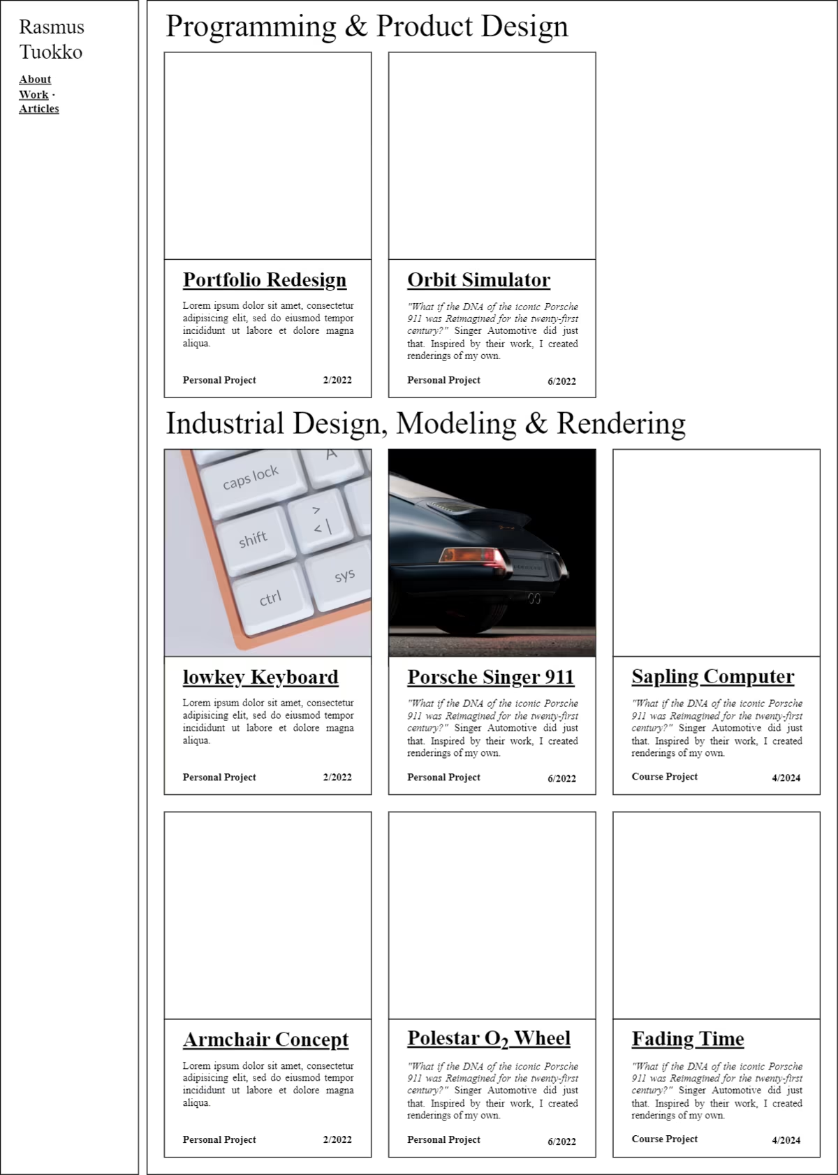
I wanted to convey readability through minimalistic and consistent style choices. During the prototyping phase I found a single-column layout to work well for that. The single column is effortless to follow and focus on without distractions on either side. It emphasized the linearity of content which makes the flow easy to control. The layout stays quite consistent regardless of the viewport size and aspect ratio. I limited the layout width such that the main column stays readable even on a widescreen device.
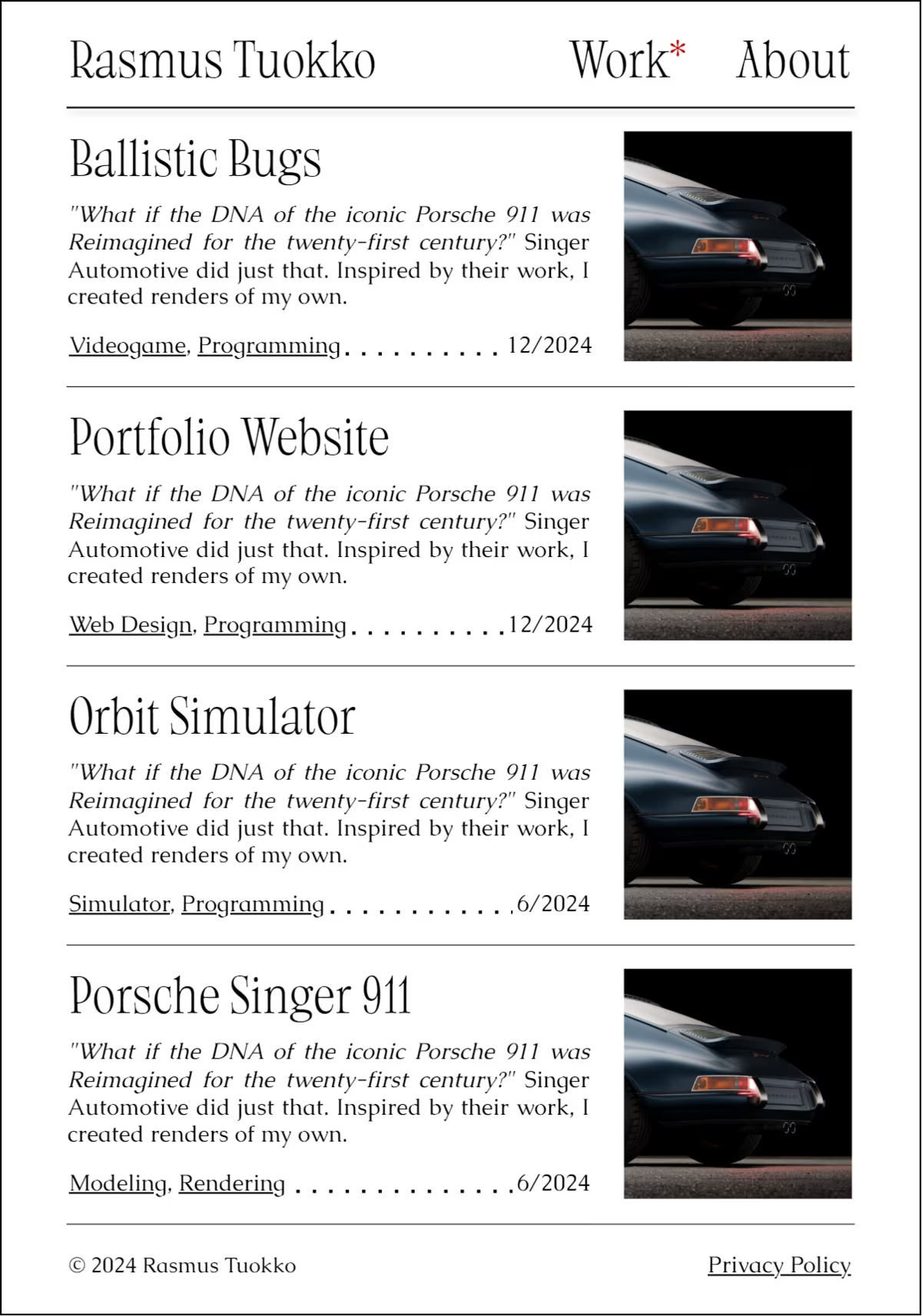
To keep the layout from shifting between pages, I constrained the landing page to the same width. This focuses the attention to the main content and simplifies image asset management. I designed the navigation bar to highlight the current page, which works as a headline. To reduce the optical footprint of the navigation bar, I added some transparency and blur to the background. I added text justification to make the layout more defined.
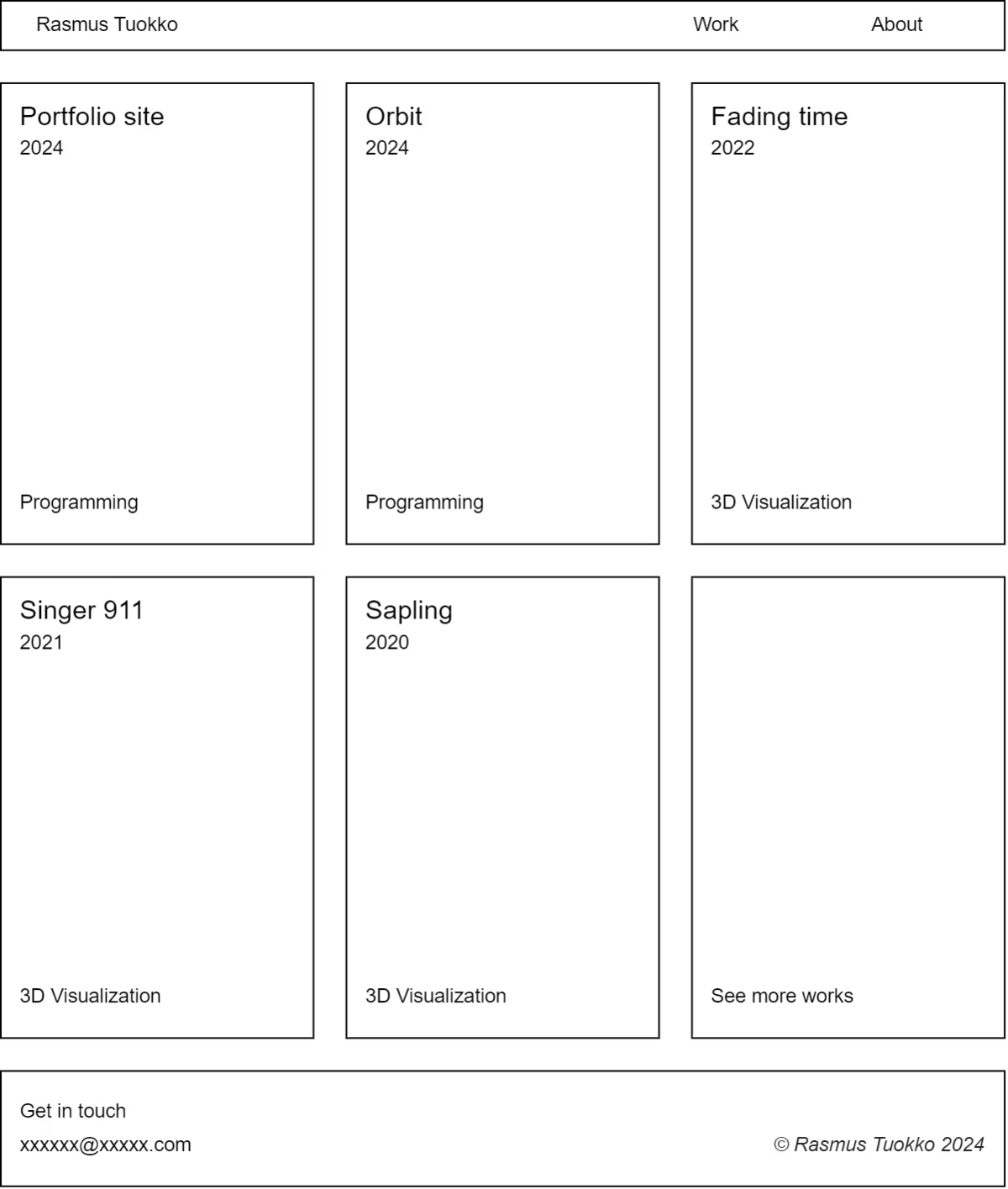
In the end I found the list of works to somewhat boring and decided to create a separate landing page that would bring the projects closer to the end user. Creating new pages was straightforward when the design system had been established.
Conveying hierarchy through typography
Since readability is one of the key design aspects, conveying the content flow and hierarchy clearly is necessary. The design relies heavily on typographic elements, meaning that the typefaces could be intriguing, perhaps even a little peculiar - though they would still need to be readable.
Finding suitable fonts, and further, font pairs, can take some time. I had set some limits to the choices: the licenses should be free, the headline font should have a narrow or condensed variation, and the typefaces should have a serif to them. I went through Google Fonts and many foundries that offer free but high-quality fonts. After some testing, I selected the recently-released Aujournuit from Colletttivo for the headlines, and Caudex from Google Fonts for the body.
The narrow headline variation would be used in cards or other contained content since it requires less horizontal space. The PP Editorial New that I had initially in mind does not fit in my license requirements, and a similar looking Libre Caslon Condensed did not have light variants. Aujournuit contains only a variable width axis but has a light optical weight by default.
Selecting the technology
By the time I began researching different technologies, there were two apparent solutions for creating websites that I had in mind. The first one was a completely custom full-stack solution with using a JavaScript runtime such as Deno and a frontend framework such as Svelte that I had used before. Since the content that I needed to support was static content, the dynamic web application stack felt like an overly complex choice.
The second idea was to use a commercial website builder such as Wordpress or Webflow to build the site. This way the site could be build quickly and hosted easily, but I felt the urge to have more control over the site and preferred to create it myself. Heavy frameworks are often unnecessary in simple static pages and add slop to the system. I wanted to avoid that.
Since my requirements were quite close to what a personal blogging site would have, I searched for solutions for that and found Jekyll. Jekyll is a static site generator that renders Markdown and Liquid templates. It also supports CSS and SCSS for styling. It felt flexible enough by being able to create custom layouts while keeping the site maintainable and lightweight.
It all clicks together
The final design steers away from mainstream trends, has perhaps a nostalgic (from a period I haven't lived in) aspect to it with the simplicity, yet it utilizes elements from current landing page designs and site structure. Technologically the site is quite modern with Cloudflare's deployment, variable fonts, and .avif image extensions.
The layout design choices make the site feel personal and humane. The single-column provides enough freedom to position the elements but does not require strict design systems and rules that more complex layouts could require for a consistent experience. This also keeps the site easier to maintain. The personality is elegantly quiet and calm with carefully selected hover animations.